
From the peace sign to the recycling logo, certain symbols are so recognizable that additional words aren’t necessary. But while most people understand the gist of the message these icons are meant to convey, many don’t know the history behind their creation. Here are six stories behind the meanings of some everyday symbols.
Peace Sign

The peace sign is now universally understood to express harmony and goodwill, but its origins stem back to a very specific movement. British artist Gerald Holtom — working with the Direct Action Committee Against Nuclear War — designed the symbol in 1958 to promote the idea of nuclear disarmament. The peace icon made its debut that same year during an Easter weekend march in England to protest the use of nuclear weaponry.
The symbol’s design is based on how one would express the letters “N” and “D” (for nuclear disarmament) using semaphore, a method of visual communication that traditionally uses flags or lights. The straight downward line at the symbol’s center represents “D” in semaphore, whereas the angled lines coming off the center line reflect the shape of “N.” Though the peace sign has since been used more generally by anti-war groups, the logo remains staunchly anti-nuke at its core.
Recycling Symbol

We can thank Gary Anderson for the modern recycling symbol. As a senior at the University of Southern California in 1970, Anderson submitted his design to a contest promoting environmental awareness. The symbol Anderson used in his design is a Möbius loop (named for August Ferdinand Mobius, one of two German mathematicians who independently discovered the properties of the strip in 1858), with each one of the three twisting arrows possessing a deeper meaning. The first arrow represents the collection of recyclable materials, while the next is meant to convey repurposing those materials into a newly manufactured product, and the last arrow symbolizes the purchase of those brand-new items.
Modern updates to the recycling logo feature a number at its center; each of those numbers (from one to seven) represents a code regarding what materials can be recycled. A “1” refers to single-use plastics, whereas a “7” is used for everything from bulletproof materials to sunglasses.
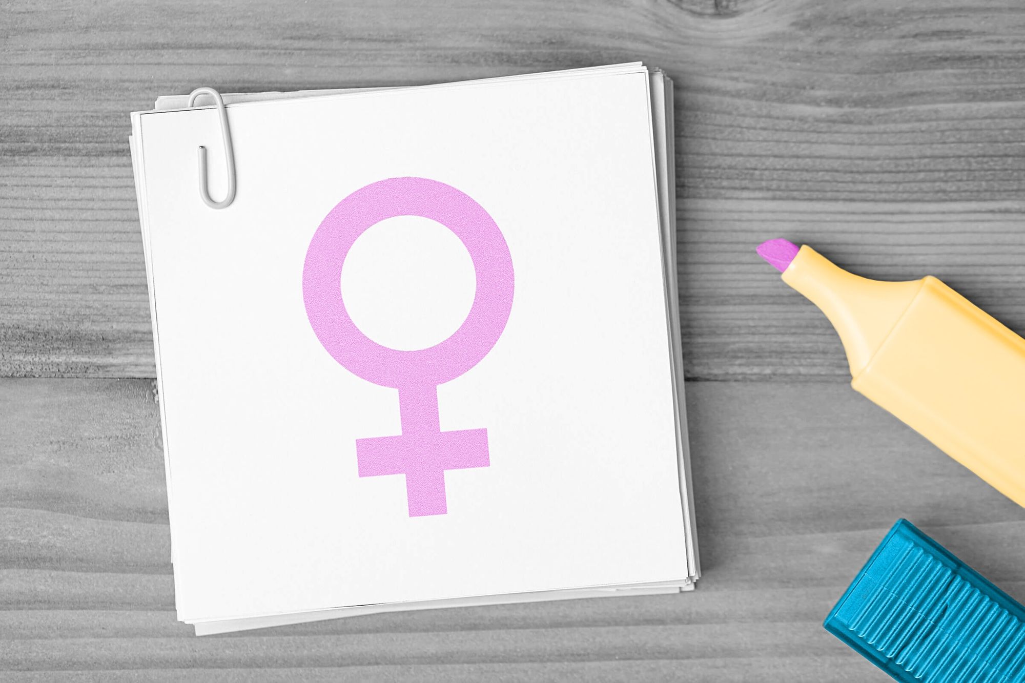
Gender Icons

For centuries, ♂ and ♀ have represented the concepts of male and female in the world of science. Long before these icons had anything to do with biology, however, they were used throughout ancient cultures such as Greece and Rome. ♂ corresponded to the Greek god Ares (Mars, in Roman mythology), whereas ♀ was tied to the Greek goddess Aphrodite (Venus, in Rome). The association between the gods and those symbols came about because of metals used to forge weaponry, with Ares representing iron (thouros) and Aphrodite representing copper (phosphoros). Over time, the Greek words for the metals were written in shorthand using the symbols that we now use to convey gender.
The symbols first played a role in biological research in 1751, when the father of modern taxonomy, Carl Linnaeus, adopted and used the icons to refer to the gender of flowers in his dissertation Plantae hybridae. Many scientists thereafter followed in Linnaeus’ footsteps, with those symbols later extending to human genetics. In recent decades, new symbols have been created based on those centuries-old designs in order to be more inclusive of those who don’t identify as male or female.
Bluetooth

Anyone who owns a smart device is likely well aware of its Bluetooth capabilities, but both the word “Bluetooth” and its logo have meanings that predate modern technology by centuries. “Bluetooth” was first used in 10th-century Denmark, a kingdom ruled by King Harald Gormsson, who was nicknamed Harald Bluetooth. Though there’s still debate as to the origins of this moniker, many scholars believe it reflects the fact that one of Harald’s teeth was rotten and blueish.
In 1996, employees from Intel, Ericsson, and Nokia met to discuss the implementation of the technology that would become Bluetooth. Intel’s Jim Kardach initially suggested the name “Bluetooth” as a placeholder, as the companies hoped to unite the PC and cellular industries in a method similar to the way that the king had united the tribes of Denmark. The name stuck, and the Bluetooth symbol was designed to represent Harald’s initials in the Younger Futhark runic alphabet: Hagall (ᚼ) with Bjarkan (ᛒ).
Rod of Asclepius

The rod of Asclepius, depicting a single snake wrapped around a staff, serves as a symbol of modern medicine. The image dates back to the legend of Asclepius, who was considered a renowned doctor in ancient Greek myth. Snakes were revered as divine creatures in Greek culture, and according to the mythology, Asclepius is said to have been taught the secrets of medicine by a snake that he healed. Asclepius’ legacy remains strong, as the image now adorns the logos of major global medicinal groups such as the World Health Organization.
Another similar symbol used by various medical organizations is the caduceus, which is associated with the messenger god Hermes. Slightly more ornate and symmetrical than the rod of Asclepius, the caduceus features two snakes wrapped around a staff, with a pair of wings emanating from the orb at the top of the staff. The caduceus has been used as the logo of the U.S. Army Medical Corps since 1902.
Barber’s Pole

Few symbols are more recognizable than a barber’s pole. This spinning red-and-white cylinder is hard to miss, and serves as a shining beacon for a place to get a haircut. Historically, however, it also signified a spot where people could have medical procedures done.
The barber’s pole reflects a time when barbers not only cut hair, but performed medical operations such as bloodletting. Prior to the barber pole, barbers would place bowls of blood in their window to advertise their bloodletting capabilities, though that act was prohibited by a 1307 law in London. Hence, the barber’s pole was born, and it has remained a popular symbol ever since.
The color red represents the blood, whereas the white reflects the bandages used to stop the bleeding. In America, you’ll notice that barber poles also have the color blue in addition to the traditional red and white found throughout Europe. One theory is that the blue represents the veins that were cut during bloodletting; another idea is that the addition of blue was simply a patriotic statement.